Saturday, 19 May 2012


Self Critique
            
            From looking at my work with fresh eyes and keeping the marking criteria in mind I feel I could include research from a broader range of contexts. I do feel my research is wide ranging and in depth with for example my use of PE texts books which informed my exploration into ossification and collage, but it could be broader in the sense of looking beyond Art Nouveau, and anatomy to inspire new pieces.
            One area I feel I could research more into is graffiti along with the materials used such as spray paint and stencils. Also I could look into different artists which use line work and colour in different ways. I have carried out observational drawings of portraits but I could explore them more by using them more loosely. I think because Art Nouveau has been a main source of inspiration my artwork has been very concise.  I think now would be a good time to start using a variety of media.   

Aims and Objectives
·         
  • Research into ‘Frank Stella,’ an artist giving to me by my tutor who uses line work and colour in a different ways
  • Look into using spray paint and stencil techniques with my portraiture
  • Carry out more thorough research into the patterns of nature
  • Work more loosely

Thursday, 10 May 2012

F.M.P. review


Since my last blog post I have gained primary source photos. I used the photography studio taking portrait shots changing the angles of the stage lights to bring out strong facial features and contrasting shadows. I was inspired to do this through the work of Gabriel Moreno. he finds inspiration from the shapes of the body. Also I feel these photos will allow me to develop pattern from defining features.  

I've looked at the anatomical illustrations of Sarah Simblet, her anatomical illustrations have great detail and a style which has a use of continuous line. I created an anatomical view of the arm and studied the shapes making comparisons to Art Nouveau. I then began to develop patterns from this source.

When developing my pattern work adapted from anatomy I over complicated the designs at first. I added to many lines and clustered the image. When I started to simplify the imagery the pattern work seemed to flow more, I started to find a balance. This then lead on to me creating a very unique portrait inspired from my Mood Board 1, containing an anatomical illustration of a head. The pattern work seemed to flow more with a sinuosity of line when applied to organic shapes. 

I now plan to take colour studies of raw meat to help inform what colours to use. I also want to explore more how nature can inspire pattern.


Thursday, 12 April 2012

Anatomical Arm Study


With this piece I was studying an anatomical view of the arm, piecing together the muscle groups. I then Abstracted the muscle fibers into an Art Nouveau inspired pattern. I'm in the process in creating my own unique pattern work inspired by anatomy.

Final Major Project - Review


So far I feel I have explored the structure of the Skull and learnt some new bones and muscles along with there Latin names. I've Carried out various sketches of a synthetic skull in a variety of angles so I became familiar with the shape. I've also researched the muscle groups of the face through the medically accurate illustrations by Albinus, an 18th century Anatomist. This research has allowed me to see how these different biological systems interact. Through portraits I was able to identity where the muscles showed through on the exterior skin and identity key features.

Looking at my self portraits I feel there's room for improvement. I've over compensated with adding shadows which weren't there, I feel I now need to experiment with different lighting conditions. Also I realized when proportions are out the slightest how this can off set the realism in the piece.

Looking over my work I feel I'm now ready to start being more experimental in particular with materials. In this next stage I'm going to start exploring patterns I can make through Anatomical studies and carry out further portraits keeping in mind to try out different lighting.

Friday, 9 March 2012

Kid Acne: Kill Your darlings Exhibition, Mellenium Galleries


This is Kid Acne first solo Exhibition in his hometown Sheffield. Viewing the gallery myself I was impressed by his murals which transformed the interior windows of the gallery. They featured a leaf motif just like on the flyer above. I really liked the aesthetics of his work and his broad use of mediums included toy figurines and skateboard illustrations. The illustrations themselves i feel don't have much depth. 
Kid Acne claims to be influenced by pagan rituals and Celtic per-history sources but from my interpretation I don' see this at all. Studying Celtic art myself and learning the works of Courtney Davis which pays beautiful homage to Celtic art and Myth Kid Acne work I feel is just purely aesthetic and cartoon based. I feel his reference of head dresses and the five pointed start to be purely spontaneous and lacks the showing of spiritual elements. for example the symbolgy behind a Celtic warriors sword is that it represented status and life after death in the other world. So when i view Kid Acne characters they have a pretty childish look to them and there just quirky. I feel he's cornered a niche in the market but I'm sure soon another graffiti artist will come with something different and his work will quickly pass.     
I'm just reflecting on this blog and I'm not saying he's not a talented artists he's just one which doesn't appeal to me. They are certain elements of his work I admire like his typo. And the ideology of combining Graffiti and Celtic Myth to create a contemporary style but i don't feel he can communicate this idea.


John Martin : Millennium Gallery, 22 June to 04 September

John Martin is an iconic 19th century Painter renowned for his scenes of Apocalyptic destruction. Viewing the work first hand I wasn't only taking away by the scale of destruction happening in his pieces but the the actual scale of his pieces. They were a very large format where your eyes would explore the waves of debris from one side of the painting to the other.

Thursday, 8 March 2012

Artists 'CIRIA' : Exhibition at 'Institut Valencia D'Art Modern,' Spain

Ciria is a Spanish Painter but lived most his life in Spain. His work is very abstract and the section of colors create a lot of tension in particularity the red. I was surprised to see with the portrait above part of a series that he used fine liners. He captures a lot of emotion, and a feeling of tourched souls, his work and been compared to Francis Bacon. His influences include Jackson Pollock and MirĂ³.  


I like his looseness with the paint which is really expressive. I feel the freedom of the strokes gives his portraits extra life and impact, you can definitely see the influence of Jackson pollock with his techniques of broad strokes.

Friday, 3 February 2012

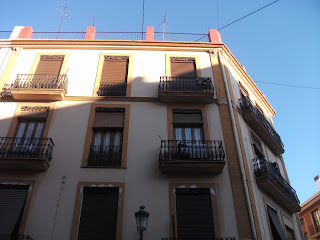
Valencia, The Old Town

Valencia is seen as one of the skateboarding capitals. you certainly get this feel not only from the architecture but also form the Urban Street art, here's a piece we stumbled apon within the Old town.


Valencia is the Capital of the old kingdom of Valencia. It has many classical building dating back to the Medieval ages many of which are influenced by Gothic architecture. Valencia was first founded by the Romans.